Case Studies
- Market research questionnaire
- Aquatic life surveys - qualitative and quantitative
- Community composition
- Population structure
- Life table experiments
- Genetic vs Environmental variation
Market research questionnaires
Market research data regarding health centres was analysed for changes in individuals' responses between survey dates and for trends at centres in each survey.
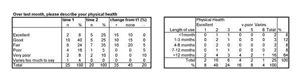
Responses were recorded from only 20 of the 25 individuals at time 2. Of the five people who said their health was excellent at time2,
two had given the same answer at time1 (10% no change in answer) and three had previously recorded their health as less than excellent (15% positive change from time1). Cross-tabulation would further specify exactly the combinations of changed answers between survey
times. The cross-tabulation shown here records individuals' physical health against the time they used the health centre. Poor health was mostly
recorded by long-term users (>12 months), reflecting their continual need for support rather than the centre causing poor health.
Aquatic life surveys - qualitative and quantitative
Spot-on Data Solutions has considerable experience in sampling, analysing and interpreting data about freshwater and marine organisms and habitats. Sampling techniques used include trawl nets, hand thrown plankton nets, quadrats, transect surveys (eg: belt, LIT), sediment samplers and visual scale assessments (eg: SACFOR). Habitats surveyed range from temperate regions such as UK and New Zealand, for freshwater and marine intertidal to sub-littoral zone surveys, to coral reefs in Australia, Indonesia, S. Pacific and E. Africa.
Community composition
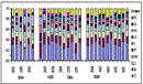
Benthic communities and habitats were monitored in several sites and freshwater zooplankton communities and environmental variables were monitored over several years,
evaluating variation in community composition, diversity, species' densities and environmental parameters.
The effects of predation were measured on six experimental populations that started out with identical composition and were grouped as "controls" or "predated". Correspondence Analysis revealed how changes developed over time and identified members of the community that contributed most to the differences between the two groups of populations.
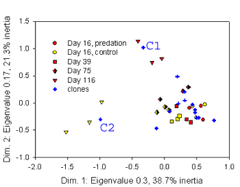
The first two dimensions of Correspondence Analysis explain nearly 60% (38.7% plus 21.3%) of the variation in the data, and distinguish the predated populations (red) from the control populations (yellow) on day 116 (downward pointing triangles). The populations remained fairly similar from days 16 to 75. The distribution of community members, represented by blue crosses, is superimposed on the distribution of the populations, indicating C1 and C2 contributed most to the difference between the predated and control populations by day 116.
Population structure
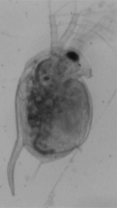
Distance matrices and clustering, as part of specialised population genetic analyses, were used to estimate the genetic structure of Daphnia magna populations in Europe.
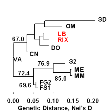
Short branch lengths (horizontal lines) indicate a close relationship between two populations (eg: ME & MM). The lower group of populations (S2 to FS1) are more similar to each other and differentiated from the top group (SD to CN).
The numbers (eg: 72.4 for the lower group) indicate confidence in the node position (the vertical line that separates two branches) and is estimated using bootstrapping, a randomisation technique. Only bootstrap confidence levels over 50% are shown.
Life table experiments
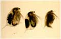
How does the amount of food or temperature affect how fast an organism grows, when it matures, and how many offspring they produce? Do all genotypes (clones) respond the same way? Fully crossed experiments were designed to test these questions using Daphnia magna in controlled laboratory conditions, using ANOVA and multivariate statistical analyses to interpret the results.
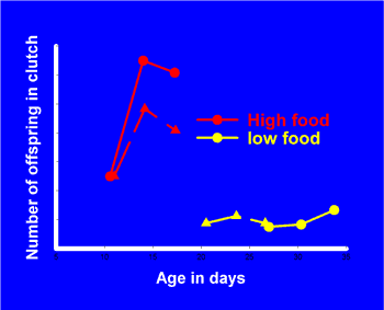
This figure shows how two clones' age and number of offspring for three clutches vary at two food levels. The first three clutches are represented by three symbols joined by a line,
for two clones (clone 1 circles, clone 2 triangles)
at high food (red) and low food (yellow). At high food both clones produce their first clutch with the same number of offspring on the same
day. Clone 1 produces more offspring in the 2nd and 3rd clutches
than clone 2, but at much the same ages. At
low food, the Daphnia produce few offspring and take longer to reach maturity. Clone 1 takes much longer than clone 2 and produces its first brood
when clone 2 produces its third.
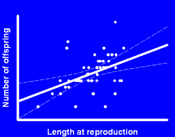
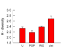
Correlation analysis reveals the relationship between different traits.
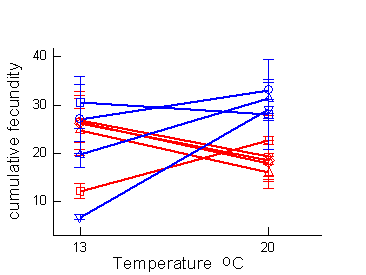
Analysis of Variance (ANOVA) revealed significant variation among clones (red and blue lines each represent a single clone) and interaction between clone and temperature, even though overall temperature had little effect on the average fecundity. Overall, two populations (blue vs red lines) showed significant difference in fecundity at 20°C but not 13°C.
Genetic vs Environmental variation
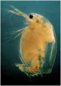
Controlled laboratory experiments were designed to test the relative importance of genetic and environmental variation for host resistance to parasite infection and to use mixed-model statistical analyses with SAS to partition out random among block and day-to-day variation. Daphnia magna clones were tested at several spore-doses and temperatures for development of infection over time, after exposure as juveniles to the bacterial parasite, Pasteuria ramosa.
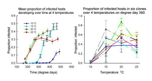
Fig. 1: On average, across all spore doses, infection appeared soon at 20°C and 25°C but was increasingly delayed at 15°C and 10°C. Time is measured in degree days (temperature x days) to compare among temperatures on an approximately equal physiological time scale. Fig 2: showing one spore-dose at one time point - there was a lot of genetic variation for infection rates at 15°C to 25°C (clone lines well spread out at each temperature) and the rank order for clones changed with temperature - eg: the most infected at 20°C (green line) was one of the less infected at 15°C. In general, therefore, a parasite-resistant clone may only be resistant in certain environments.
“spot-on” – absolutely correct, very accurate, mathematically or statistically exact.